

For nearly 20 years as a co-owner and worker at Stumptown Printers I’ve been collecting ink underneath my fingernails in pursuit of a commercial printing career. As things change with technology and the industry as a whole, our business is feeling the pressure and having to adjust rapidly. We’ve been actively working to create more opportunities to further the craft of printing through Stumptown Printers and related volunteer activities at the C.C. Stern Type Foundry, but we need a boost from the community to make this venture a continued success. Please take a moment to read our post and consider a gesture of support.

Summer Intensive Letterpress Course
PNCA is offering a set of summer intensive courses from June 18-23rd that I’m pleased to take part in. Registrants can choose from seven different tracks, including a letterpress class that I will teach. I will be working on a small edition broadside print, using it as a teaching tool for demonstrations and discussion. In turn, students will design and print their own editioned poster, broadside, or simple folded book structure. The focus will be on hand set type and creative image making. Participants will receive instruction on how to trouble-shoot challenges involved in printing: we will discuss how to achieve fine printing through exact make-ready and packing techniques, careful typesetting and registration, ink mixing for color matching, foolproof lockups, and proper impression on the Vandercook Proofing Press.
As part of the class, students will be able to opt in to two special add ons:
A private weekday visit to Stumptown Printers to see the workings of a small “job shop”, and a guided tour of the C.C. Stern Type Foundry on June 16th to witness the process of metal type casting.
Register here: http://ce.pnca.edu/adult
Marfa Myths 2018
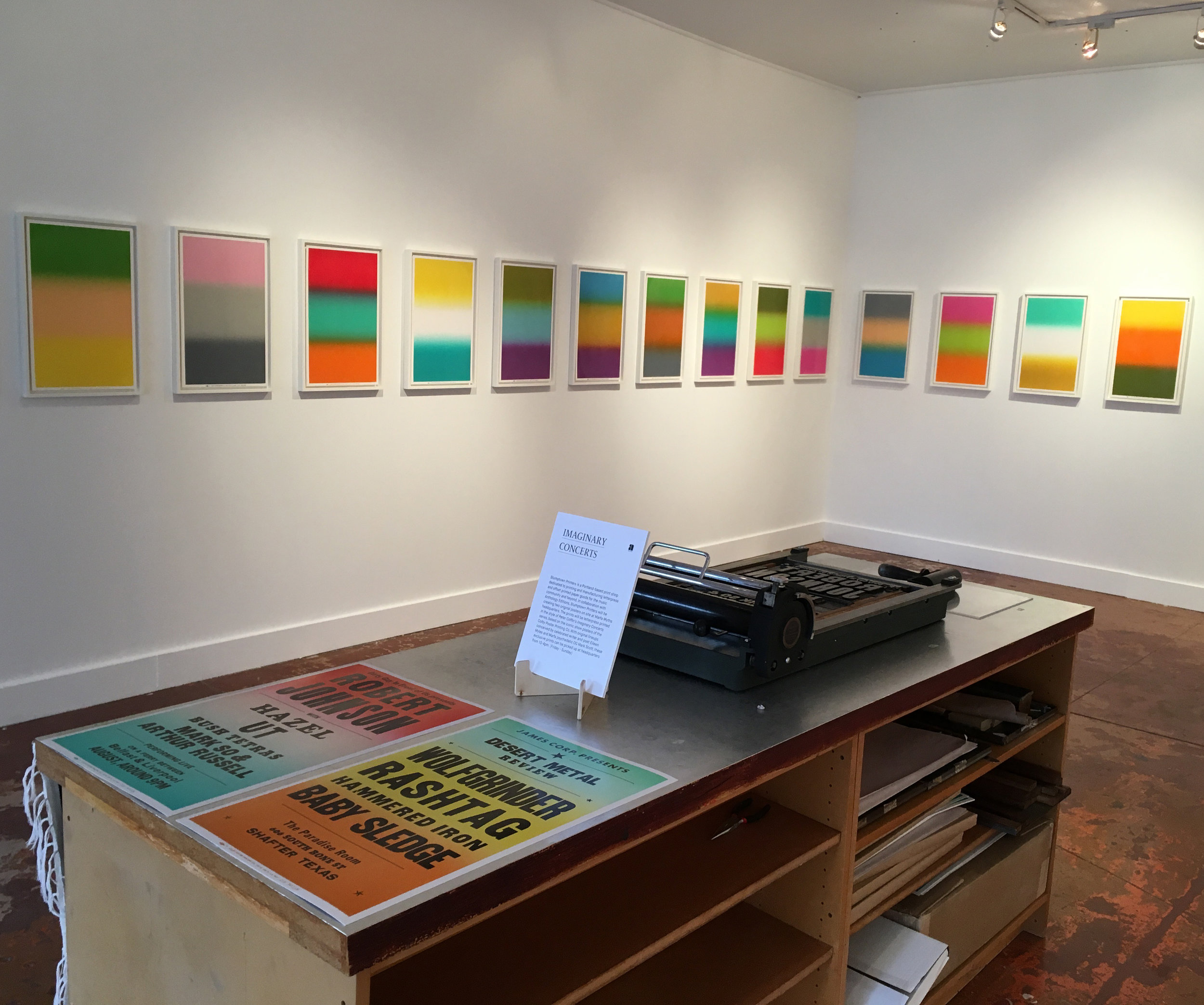
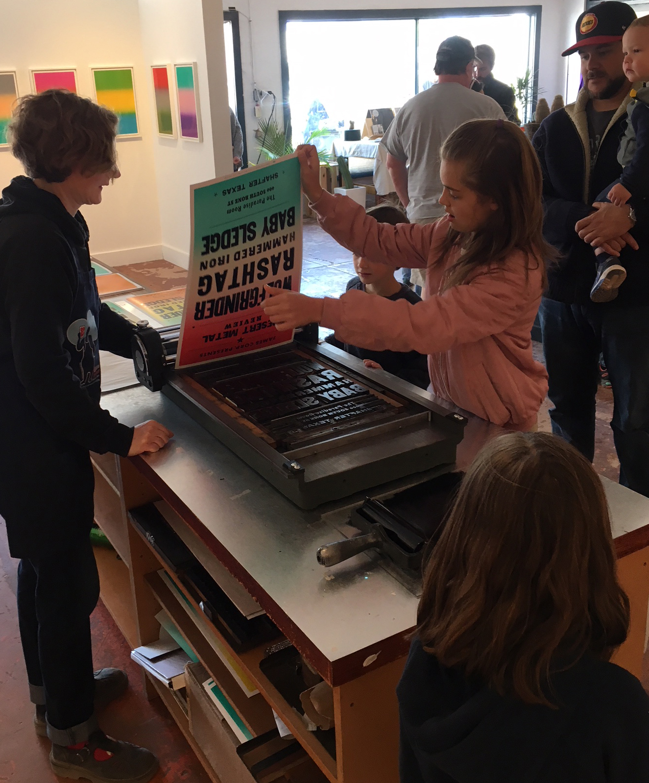
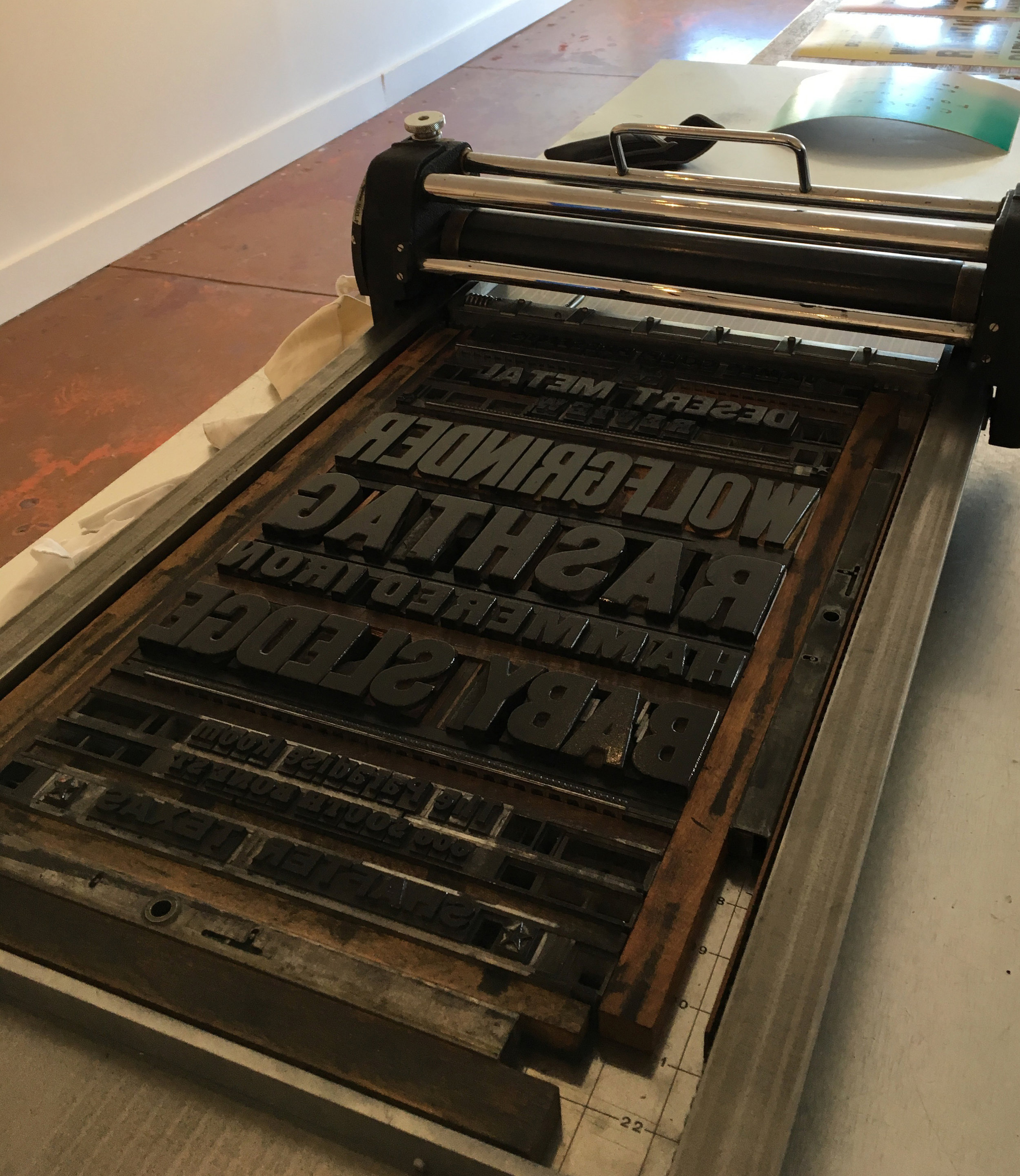
Thanks to Anthology Editions for including Stumptown Printers as part of Peter Coffin’s Imaginary Concerts exhibit at Marfa Myths 2018! Peter had worked with Colby Poster Company previously to commission a number of custom split fountain prints which were on display. We replicated three of the color combinations in a very limited quantity as part of this project, then set and shipped two complete type forms to Marfa for the event. Each composition was an invented lineup, one curated by Eileen Myles and another by Mark Scott, and we locked them up on site using a sign press borrowed from Red Press Printing. Brian and I had great fun helping locals and festival goers pull commemorative prints over the course of three days. We marveled at how quickly the ink cured in the dry desert atmosphere!
Photos are from Marfa Studio of Art gallery space.
You can also check out the Marfa Myths unofficial keepsake we made to bring with us on the print work page.
The Slow Read →
Over the past year I have been assisting as a project manager to local artist and educator, Barb Tetenbaum, with an incredible public art project called The Slow Read. It is a summer-long viewing of page spreads of Willa Cather’s novel, My Antonia, in celebration of its Centenary. Barb has been working with this novel for nearly a decade, creating art installations and printing artists books inspired by the literary work. This transformation of the novel into a nationwide daily visual simulcast is designed to be experienced with others in community spaces like libraries, town centers, schools, and art centers. It’s an opportunity to appreciate the value and beauty of the novel, and to discuss some of the timeless issues addressed in the work — immigration, women’s rights, and land conservation. I hope you will take a moment to watch the Kickstarter and consider a contribution to the campaign.
Printing Business Course at PNCA
Feb 28, 2018 - Mar 14, 2018
6:30PM - 8:30PM
This offering is a conversation for printers about decisions to make and things to consider before launching a company or taking on commission jobs. Covers professional practices in the trade, experience & education, business plans & financial resources, legal and moral responsibilities, client management, vendor sourcing, operations, pricing and equipment.
Register on the PNCA Continuing Education site


Guild Card No. 5
Letterpress, hand-set metal type
2.5" x 3.5"
The C.C. Stern Type Foundry issues new cards annually to supporters of the museum. Each guild card is printed in a small edition.
Type is hand-set 12pt. and 18pt. Centaur, designed by Bruce Rogers. The Monotype caster and keyboard ornaments were purchased from Stichting Lettergieten 1983, in Westzaan, The Netherlands. The backside pattern was built from Monotype ornaments cast at the C.C. Stern Type Foundry, the number five is Franklin Gothic Condensed.

Pressing On at Clinton Street Theater
The C.C. Stern Type Foundry is presenting a screening of Pressing On: The Letterpress Film this coming Tuesday, the 19th at The Clinton Street Theater. You can see the post about the event and get details here. It’s a beautifully shot film that interviews multiple generations of the letterpress community in the Midwest. Some of my favorite printers and type casters are featured, including a few that we visited in their home shops just a couple weeks ago!
I printed the poster at Stumptown Printers — a form constructed entirely of hot metal composition. A real treat! Ludlow, Linotype and a Monotype Sorts Caster were all used to cast the type and ornamentation, which we printed in two colors on Fabriano Rosapina. The particulars are in that red arrow, if you truly want to geek out about which type face is which. A limited amount of posters will be for sale at the event, helping to support the costs of the film screening.
Looking forward to gathering at the theater!

Portland Letterpress Fair
The Portland Letterpress Fair is this weekend!
Presented by the Portland Printers Alliance as part of Design Week Portland. We’ll be there and look forward to seeing you!
11 a.m.-5 p.m
Sunday, April 23, 2017
at The Redd
831 SE Salmon, Portland, OR 97214


Codex Book Fair 2017
Back in February, Brian and I ventured down to the SF Bay Area to peek in on the 2017 Codex Book Fair. It was our first visit to this biennial event, and proved to be just as eye opening as promised. The Craneway Pavillion was filled with over 200 people showcasing their artists books & fine press publications, and hundreds of visitors strolling the aisles to peruse the offerings. Exhibitors were there from all over the world, with a focus on Chinese Book Arts and notable international contributions from Germany, South Korea, Italy and the UK.
Though many methods of production are being used in contemporary book work, there was, of course, a lot of overlap with our typecasting community. The progress that Ed Rayer (Swamp Press & Letterfoundry) and Barbara Henry (Harsimus Press) have been making with their Kliluk asemic typeface is impressive, and Barbara had both spec sheets for the first castings and also an example of her book in progress. “The Seaweed Journal” uses the Kliluk typeface to tell the story of an alien mermaid experiencing the underwater world on earth.
Portland-transplant, Andres Chaves of Clinker Press had his fine books for sale, most of which focus on the Arts & Crafts movement or relate to printing arts specifically. The majority are cast in Intertype and Ludlow composition. The folks from M&H Type were roaming the pavilion, though they didn’t have a table set up. And Russell Maret was displaying some of his newer books, featuring type he designed, one cast at the Type Archive and another from Swamp Press.
We had the chance to visit with Mark Sarigianis of Prototype Press while in the Bay Area, and to take a quick peek at his studio where work is in progress on “Ham on Rye”, the Bukowski classic. The prospectus is out, the book uses hand made paper from St. Armand and is set in Goudy Powell. Nearly all the type is cast, initial proofs have been pulled, some final pages already printed. All this in a very bare bones studio space — when we visited, the building roof was leaking and the studio was covered in fireproof tarps which had to be emptied of water puddles daily. It’s amazing & heartening to see that Mark is driven to carry on the work that David Johnston and he started, with true passion for the printing of finely crafted books from metal type.

A Smooth Sea ...
Letterpress, hand-set metal type
Found image
4" x 6"
Created as a New Year's card to send to friends and family.
Type is Monotype Bulmer Italic and ATF Spartan. Printed in one color.

Hallwyler Printing Company
In a random internet search for some printing related items, I came upon a listing on the UK eBay site for a “Dated 1960 Cover Portland Hallwyler Printing Company” envelope. The image above is what turned up — quite a specimen of composition work, with its presses and people built out of type! This particular company has been on my list of print shops to research, as it has been mentioned by others as a major player in the print scene in Portland during the mid-1900s.
Hallwyler Printing Company was founded in 1926 by Fred O. Hallwyler (1901-1978). Fred was the son of Swiss immigrants who came to the US when they were in their mid-twenties. Shortly thereafter Fred was born. He began his printing career at the Portland Daily News Telegram, and worked through the ranks to become a master typographer. Not much information on the early years of the Hallwyler company is available, but it is noted that Fred’s father, Gottlieb, also worked at the shop. By the mid-1950s business seemed to have been thriving, and in 1955 an expansion added 10,000 sq feet to their existing facility at 1020 E. Burnside. The building extension filled out the block to 10th Avenue, ultimately changing their address to 10 SE Tenth.
A feel-good story in the Oregonian in 1957 tells the tale of a high school student who recovers a fire-proof safe from an overgrown lot in North Portland. It turns out to belong to Hallwyler Printing and had been stolen from the shop in the middle of the night, hauled away in the company truck by an opportunistic burglar. The safe contained only the company records and no money, but was returned unopened anyway. The boy who found it and turned it in was rewarded with $50 which he used to rent a tux for his Junior prom at Roosevelt high school. Fred and his wife, Alice, apparently delivered the check in person.
At this time Fred’s son Robert was working for the company in a management role. Hallwyler was a well-respected job shop in Portland, and both Fred and Robert were elected as officers for the Oregon Printing Industry professional association at various times. Fred served as secretary in 1956, and Robert held the office of president in 1961.
In 1966, the Hallwyler Printing Company announced a merger with Agency Lithograph Company, and stock was exchanged between the two companies. Later in that same year, the firms took part in the historic expansion of the Graphic Arts Center, wherein they joined with Abbott Kerns & Bell, Paul O. Giesey Adcrafters, and Meredith Type Founders at a newly constructed facility at 20th and NW Wilson. This combination formed one of the most historically renowned job & advertising print organizations in Portland.

Snowflakes
Letterpress, hand-set metal type
4" x 6"
This haiku card utilizes ornaments cast at the C.C. Stern Type Foundry, once again playing with pattern and alignment. Designed using two metallic inks just slightly different in shade, so the effect is a subtle color shift that recalls the delights of a snowy sky.
Created for a winter ephemera exchange, printed in two colors. Ornaments are 18pt. Monotype 26, type is hand set Monotype Caslon.


American Typecasting Conference 2016
I recently attended the American Typecasting Fellowship (ATF) Conference, and as usual was inspired and recharged by the event. The 2016 conference was hosted by the Book Arts Center at Wells College and the Bixler Press & Letterfoundry in the Finger Lakes Region of New York, and included additional visits to Virgin Wood Type and the Cary Graphic Arts Collection. Over the five days from August 10th-14th, attendees were treated to a variety of presentations, hands-on typecasting sessions, social gatherings, and impressive thunder & lightning storms.
On Friday, there were more than four hours of talks on technical matters, equipment relocation, and research related to typecasting technology. A couple highlights:
Greg Walters talked about his latest forays into casting large type on his Barth Pivitol Caster, and brought specimen sheets for both the 144pt. Stymie Inline Titling and American Eagle projects he’s completed. We received a briefing of developments related to the Sterling Type Foundry — Bob Magill will continue Dave Churchman’s legacy and have type and ornamental material for sale indefinitely. Ed Rayher of Swamp Press talked about his current undertakings, including an interesting project working with Barbara Henry’s designs for an asemic calligraphic font, his recent casting of “Baker” for Russell Maret, and an experimental engraving of the Doves Type revival typeface.
The opportunity to visit the press and letter foundry of Winifred & Michael Bixler is more akin to a pilgrimage than a mere “visit”. The work that they do holds to a high standard – from casting fonts for printers, to repro proofs and fine press printing for publishers, the Bixlers have continued to work with Monotype composition for over 40 years. Their attention to detail can be found beyond their typography, too. Their shop is impeccably organized (admittedly restored to order in honor of the ATF Conference) with spacing material and tools exactly where needed, plenty of open workspace, and color coded systems in both the casting & printing rooms. In their association with Wells College, they also offer instruction and encouragement to all levels of printers.
Hands-on work is integral to each ATF Conference. Beyond the technical sessions on the Monotype Composition and Super Casters , many tips and tricks were exchanged. I want to note personal thanks to both Bob Magill and Jim Walzak for taking the time to answer my questions regarding the sorts casters — they both offered possible solutions for little bugs on one of the machines that I work with while volunteering at the C.C. Stern Type Foundry.
Informal presentations on Saturday from Richard Årlin of Sweden and Bradley Hutchinson (Austin, TX) were inspiring as well. Bradley is in the process of casting a specimen of Andromaque, a typeface designed by Victor Hammer. The connection to this year’s conference was direct — Hammer was a teacher at Wells College until 1948, and designed American Uncial, among other faces while he was there.* Hutchinson’s current casting is made from electroformed matrices from the collection of Paul Hayden Duensing. It’s an interesting typeface. Additionally, Bradley brought prospectuses for Stanzas by Pietro Bembo, cast in Blado and Poliphilus types, and featured in Matrix 33. Richard Årlin shared a selection of his books from his Stamp Och Press, including an example of his recent endeavor The Lost Subiaco Donatus (2013). Richard is one of few artists working on his fine press books from start to finish — designing the type and carving the punches, punching mats and casting the type, making the paper & ink by hand, creating & printing photographic etchings and binding his own books. I forgot to ask if he makes his own thread, too!
Finally, I would be remiss if I did not note the keepsake exchange, a welcome opportunity to swap print work with other participants (For our contribution, Stumptown Printers die-cut Monotype mold gaskets for the C.C. Stern Type Foundry to use as their give-away keepsake). There are a variety of approaches represented in this selection of ephemera, plenty to review and consider before our next gathering in two years.
*We were able to view a number of Victor Hammer’s matrices and punches at the Wells College Library, including American Uncial.

Lane-Miles Standish Printing Company


While browsing one of the Arcadia Publishing books titled Portland’s Slabtown, I noticed a reproduction advertisement for the Lane-Miles Standish Company. That ad became the perfect excuse to continue researching the print shops of Portland’s past.
The Lane-Miles Standish Printing Company began in 1919 at 309 Southwest Oak Street. At that location they were surrounded by at least nine other printing outfits within a three block radius, including Kilham Stationery (see previous blog). Despite the competition Alan Lane, Sr. and Miles Standish ran a successful business and after 10 years they contracted with Austin Company Architecture Firm to realize an ambitious new building concept. Their future print shop was designed with an armory castle-top turret at the North corner entrance, to be used as staff offices, as well as a single story 100x150 ft extension for their production facility. Their plant was to be located at NW 19th and Raleigh, and their two mile move to the industrial district was considered bold at the time.
Concurrent to their relocation to the Slabtown neighborhood, Lane-Miles Standish became one of two Portland-area printers to introduce the Jean Berté Watercolor process to their customers. Available to American printers starting in 1927, the Berté process used hand engraved images cut into hardened rubber which eventually became the plates used for relief printing. Berté’s inks were designed to lay down in large, solid, brilliant swaths of color, and to overlay in ways that utilized their semi-transparencies to form new colors. Lane-Miles Standish used this print method for local advertising work and art prints, allowing them to expand their offerings beyond the work they were primarily known for — business forms, stationery & envelopes, folding boxes, police parking tags, and financial reports. A 1933 article in The Oregonian also notes that the company would be adding staff to expand into printing jigsaw puzzles, from the printing of photo imagery through to the process of die cutting the pieces.
Alan Lane, Sr. and Miles Standish served as the corporate officers for their printing company up until each retired or died. Miles Standish was active in local civic organizations in addition to his business interests, and was appointed as a Port of Portland Commissioner by the Governor in 1934. Standish died at age 61, in July of 1949. Alan Lane, Sr. worked at his company for 26 years, until 1945, when he was succeeded by his son, Alan Lane Junior. Lane Jr.’s service lasted until 2000. At that time, Alan’s son Steven and a Mr. Frank Wall became the registered agents. Lane-Miles Standish Printing Company was dissolved in 2005, but the building at 1539 NW 19th is still owned by the families of the founders.
The original structure is now listed on the National Register of Historic Places as an example of Late Gothic Revival architecture, and is home to the offices of Capital Property Management and North marketing & design firm. In 1962 an additional 5,000 sq foot warehouse was built to fill out the block. That warehouse was demolished in 2006 to make way for “Lane 1919” a six story tower that includes upscale apartments, office space and retail.

Kilham Stationery and Printing Company
For years I’ve been curious about the print shops of Portland’s past, and the workers who helped keep the skills alive. The printing craft had a huge influence on the industries of this city, businesses here had both a ready supply of paper from local mills and the means to distribute printed matter by rail and boat early on in Oregon’s statehood.
Last month I was looking through some Multnomah Typographic Union contract negotiation papers that were donated to the C.C. Stern Type Foundry, and noticed a little sticker at the front of the book. The sticker noted the scrapbook model number and the supplier — Kilham Stationery & Printing Company. This led me on a weeks long search to see what I could find out about the history of this shop, once located in downtown Portland. So here’s what I’ve got so far:
Kilham Stationery and Printing Company was established in 1898 by Edward D. Kilham. Original incorporation documents and certificates held at the Oregon Historical Society show that initial stock owners included Howard’s wife, Frances, along with other family members, in addition to Rowland Waltz (who had the majority, 25 shares) and James S. Ball (who worked for many years as company Director). When Howard passed away in 1929, ownership of the company was transferred to his son, Horace. Phil Mestcham and James Ball are listed as President & VP in the 1937 Printing Trades Blue Book, with Horace listed as the Treasurer. Howard’s wife (and Horace’s mother) continued to work at the company in a management role until her death in 1951 at age 79. Articles in the Oregonian suggest that she still went in to the office daily up until the time of her passing.
In 1900 two shop locations were noted, one at SW Fifth and Oak and the other at 267 SW Morrison, the second of which was closed in 1903. The flagship building at Fifth and Oak boasted “Everything for the Office” — six floors dedicated to office furniture and equipment, architects & engineers supplies, signage, leather goods, typewriter supplies, bound and loose leaf books, forms, bookkeeping equipment, date books, house numbers, pens, pencils, clocks, and more. On the fourth and fifth floors manufacturing of rubber stamps, printing, engraving, embossing, and bookbinding services were realized.
In 1963 George Goodall became President and Treasurer of Kilham. Goodall was initially hired in 1942, and was serving as Vice President of the corporation by 1958. His presence marks a continuity to the transition, aided by his Vice-President, Robert Hoyt. Hoyt started working at Kilham Stationery & Printing in 1946, and eventually succeeded Goodall as the President and owner of the company. At this time, the headquarters were moved to 134 NW 8th Avenue.
In 1979 the company was sold again, this time to Wakefield Mack. Robert Hoyt continued on as the general manager, presumably until the company was dissolved in February 1991. The final location of Kilham Stationery and Printing Company was at 509 NW 10th Ave in Portland.
In it’s heyday, Kilham produced a number of books and pamphlets under it’s own imprint, most of which seemed regionally focused. A sample of early color litho, Oregon in Color, can be found in manuscripts at the Oregonian Historical Society. The technique for color reproduction in this 1925 publication is much like the tri-color process we have been working to re-create at Stumptown Printers.
For commissioned job work, they offered Linotype and Monotype composition, along with hand set work in a variety of typefaces. Their print customers included advertising firms, small businesses, and larger manufacturers needing everything from customized office forms to a printed and bound catalog. Many customers hired Kilham to print promotional materials for their companies — postcards, pamphlets and brochures. Numerous advertisements from historical editions of the Oregonian newspaper advance their “Quality Printing” with the “BEST and COMPLETE service in everything pertaining to the printing art.”
It’s hard to beat that.

The Portland Letterpress Fair is this weekend!
This year’s fair is presented by the Portland Printers Alliance as part of Design Week Portland. We’ll be there and look forward to seeing you!
10 a.m.-5 p.m
Sunday, April 17, 2016
at the Bison Building
421 NE 10th Ave., Portland


Ink + Metal + Paper
Letterpress, metal type
4.25" x 6"
This announcement card was collaboratively created at Stumptown Printers for an exhibit of letterpress work at 23 Sandy Gallery in early 2016.
The front side is hand-set Othello and Monotype ornaments cast at the C.C. Stern Type Foundry. The backside is Linotype composition, set in Melior on a Linotype 31 by Brian Bagdonas at Stumptown Printers.

Ink + Metal + Paper Exhibit at 23 Sandy Gallery
I'm really pleased to be participating in this exhibit, and to have helped to curate the work of some amazing letterpress artists working with metal type.
Exhibit:
February 4-27, 2016
Reception:
First Friday, February 5, 2015
5:00 - 8:00 p.m.
Ink + Metal + Paper is an invitational exhibition curated by the C.C. Stern Type Foundry, a working museum and non-profit organization dedicated to preserving the art and industry of the typographic form located here in Portland. Ink + Metal + Paper features letterpress work from a select international roster of renowned printers and includes books and broadsides showcasing the use of metal type, ornaments, and border elements in relief printing.
The exhibit includes the work of twenty-four printers, from as close as Portland to as far away as Belgium. It also includes representative pieces from C. Christopher Stern, Jules Remedios Faye, and Jim Rimmer, three book artists who inspired the C.C. Stern Type Foundry since its early inception.
Artists featured in this exhibition include: Brian Bagdonas, Inge Bruggeman, John Christopher, Jennifer Farrell, Julia Ferrari, Rebecca Gilbert, Patrick Goossens, Joseph Green, John Grice, Barbara Henry, Richard Hopkins, Darrell Hyder, Myrna Keliher, Emily Larned, Norman McKnight, Sarah Nicholls, Pat and John Randle, Amy Redmond, Mark Sarigianis, Ivan Snyder, Jessica Spring, Barbara Tetenbaum, Sandy Tilcock, and Jenny Wilkson.
Online catalog is here. Print catalogs of the exhibit available for sale at 23 Sandy Gallery.

It was brilliant!


A belated THANK YOU to all the folks we met or reconnected with on our trip to the UK and Belgium, it was a marvelous reminder of the strengths of both the print and music communities.
Brian and I arrived in the UK a bit road-weary, but the reception from locals in Stroud and at nearby Whittington Press made us swiftly forget. Thanks to John & Pat Randle for taking a break from Matrix 33 production to share their brilliant print work and stories with us. John Grice stopped by, and we were able to bum a ride with him to check out Evergreen Press and also meet Stan Lane at Gloucester Typesetting. Thanks to both for sharing time and fine typographic work with us!
The St Bride Wayzgoose was great fun, and a wonderful gathering of printers and print enthusiasts. There are too many people to thank to list them all here, so suffice it to say we appreciated the camaraderie and hospitality of all. Special appreciation to Mick Clayton for organizing and to Helen Ingham for encouraging us to attend in the first place. If you missed our previous posts, you can see photos and read about the event here. It was nice to reconnect with ex-pat Alix Christie and also our 2015 Stumptown Printers intern, David Armes of Little Red Rabbit/Hot Bed Press /Red Plate Press there as well. We definitely did not spend enough time exploring the library and the collections at St Bride, so we’ll have to do it again!
We hopped the train over to Ghent to visit Armina Ghazaryan of Type & Press, who was kind enough to let us spend the day poking around the print and casting collection at MIAT (Museum of industry, labor & textile). A long walk around the charming medieval city center and a couple beers later we were sorry to say goodbye. Then on to Antwerp to see Patrick Goossens and to finally visit the renowned Plantin-Moretus museum. The collections at the museum are amazing, including some of the oldest manuscripts and earliest printed matter still existing. The print shop was full of kids getting lessons on copperplate engraving and letterpress printing, right in the same building that housed the original print shop from 1576-1876. Patrick spent the day (and most of the evening!) showing us Letter-kunde Press and his extensive collection of hand presses, casting equipment and other printing related machinery. We barely made it out to eat before all the restaurants were closed! The Belgian hospitality was definitely generous — thank you Armina and Patrick.
Our last stop was back in London where we managed to visit Helen Ingham at Central St Martins. Thanks also to Simon & Ira at the London Centre for Book Arts for making time to give us a tour of their facility on Saturday while in the midst of teaching a beginning letterpress workshop! We boarded the plane headed back home with plenty of good memories and inspired ideas.
Letterpress Class Starts April 14, 2015
The Letterpress Intro class that I’m teaching through PNCA’s Continuing Education Program starts next week at their new campus (511 NW Broadway). Eight weeks of letterpress fun, along with lots of vocabulary and technical instruction. This class focuses on hand set metal type, students will complete one collaborative exercise and one solo project during the course. The link to register is here.